How to Make a YouTube Thumbnail That Gets Clicks (2026 Guide)
Quick answer: a clickable thumbnail communicates one idea in under half a second: a face with a readable emotion, at most three visual elements, 3–5 words of high-contrast text that add tension to the title — all still legible when shrunk to fingernail size. The 7 steps below turn that into a repeatable process.
A viewer scrolling the YouTube feed gives each video roughly 0.3 seconds of attention before moving on. In that moment, your thumbnail either earns a pause or it doesn't. Titles get read after the image stops the scroll — which makes the thumbnail the single highest-leverage asset you control.
This guide is the design counterpart to our thumbnail size & specs article. That one covers dimensions and limits; this one covers what to actually put inside the frame.
Why thumbnails matter more than titles
The chain is simple: thumbnail → click-through rate (CTR) → impressions. When your CTR rises, YouTube's recommendation system shows the video to more people, which compounds. A video with a 6% CTR doesn't just get 2× the clicks of a 3% video — it gets shown more, so the gap multiplies.
And here's the underused part: you can change a thumbnail at any time, on any video, with no penalty. Swapping the thumbnail on an underperforming video is the cheapest growth experiment on YouTube — no re-upload, no lost comments, just a new first impression.
Step 1 — Start with one clear emotion
Human faces are scroll-stoppers; our eyes lock onto them involuntarily. But a face alone isn't enough — it needs a readable emotion: shock, joy, doubt, triumph. The emotion is a promise about how the video will make the viewer feel.
- Close-up beats full body. The face should fill roughly a third of the frame.
- Exaggerate slightly. A neutral expression at 168 px reads as boredom. What feels theatrical in the editor reads as "normal" at feed size.
- Eye contact or eye direction. Looking at the camera creates connection; looking at the object in frame directs the viewer's attention to it.
Step 2 — The 3-element rule
Every strong thumbnail can be inventoried in three items or fewer: a face, an object, a short text. The most common beginner mistake is treating the thumbnail as a movie poster — cramming in the location, the guest, three captions and a logo. Each added element steals attention from the others.
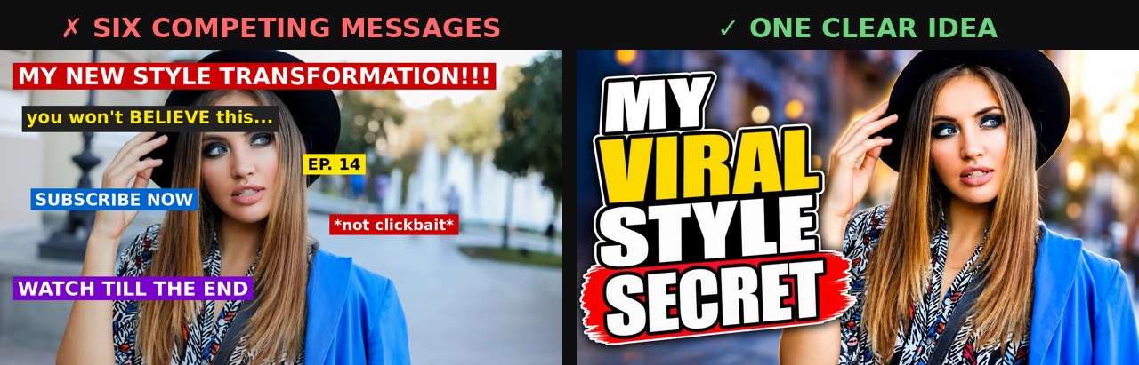
A useful exercise: describe your thumbnail in one sentence. "Me, shocked, holding a burned GPU" — good. "Me in my studio with the new mic and a banner about the giveaway and the episode number" — that's four thumbnails fighting in one frame.
Step 3 — Text: 3–5 words, never the title again
Thumbnail text is read in a single glance, not parsed word by word. Past five words, people skip it entirely.
- Add tension, don't repeat. If the title says "I tested 5 budget microphones", the thumbnail text should say "ONE IS A SCAM" — not "Testing 5 mics".
- Big, thick, bordered. Heavy sans-serif, with an outline, shadow or solid plate behind it so it survives any background.
- Caps for impact, sparingly. ALL CAPS on 3 words is punchy; on 8 words it's shouting static.
If the image alone tells the story — a cracked phone screen, a before/after physique — consider no text at all. Zero words is a valid and often premium-feeling choice.
Step 4 — Contrast that survives the feed
Your thumbnail never appears alone. It sits in a grid next to a dozen competitors, on a white interface by day and a dark one by night. Design for that battlefield:
- One dominant color + one accent. Two or three colors total. Muddy, desaturated thumbnails vanish in the grid.
- Separate subject from background. A subtle glow, rim light or background blur makes the face pop forward.
- Avoid YouTube's own red and white as your base. They blend into the player UI. Yellow, cyan, green and orange stand out against both themes.
Step 5 — Design for the small screen first
Over 70% of YouTube watch time happens on mobile, where your masterpiece renders at roughly the size of a postage stamp. The professional habit: zoom your draft out to ~10% and squint. If the emotion and the text still land, ship it. If you have to lean in, simplify.
Remember the technical side too — exact dimensions, the 640 px minimum and the new 4:5 mobile crop for vertical videos are covered in our size guide. The short version: keep faces and words in the central 60% of the frame.
Step 6 — Stay consistent, build a recognizable face
One great thumbnail wins a click; a consistent style wins a subscriber's click every time. When your videos share a visual fingerprint — same color accent, same text placement, same framing of your face — returning viewers spot "your" video in a crowded feed without reading anything.
That doesn't mean copying the loudest channel in your niche. The MrBeast formula (saturated colors, open-mouth shock) works for MrBeast-scale entertainment; the same styling on a woodworking tutorial reads as noise. Consistency means your pattern, repeated — not someone else's pattern, borrowed.
Step 7 — Test, measure, swap
Even professionals can't reliably predict which thumbnail wins — that's why they test. YouTube Studio's built-in "Test & Compare" lets you upload up to 3 thumbnail variants; YouTube splits your real audience between them and promotes the one that earns the most watch-time share.
The working rhythm:
- Publish with your best guess.
- If CTR sits below ~3–4% after the first days, run a test with 2 alternative variants.
- Change one variable at a time — the emotion, the text, or the background — so you learn what actually moved the number.

BYSO generates 3 thumbnail variants in different styles from one video link — a complete A/B test set, plus SEO title, description, tags and chapters, in about a minute.
Get 3 test-ready thumbnails →Common mistakes that kill CTR
- Promising what the video doesn't deliver. Clickbait spikes CTR, craters watch time, and the algorithm notices within hours.
- Repeating the title word for word. You're wasting your second communication channel.
- Thin fonts and tiny details. Invisible at real-world sizes.
- A logo eating 20% of the frame. Your channel name is already displayed under the video.
- Text in the bottom-right corner. The duration badge sits exactly there.
- Generic stock faces. Viewers pattern-match stock photos instantly and read them as spam.
FAQ
What makes a good YouTube thumbnail?
One clear idea, readable in half a second: a face with a real emotion, at most three visual elements, 3–5 words of high-contrast text, and a composition that still works at 168 px wide.
What size should a YouTube thumbnail be?
1280×720 px at 16:9. Full specs, limits and the mobile 4:5 crop are in our thumbnail size guide.
Should I put my face on every thumbnail?
If you're the face of the channel — usually yes. Faces with readable emotion consistently outperform object-only thumbnails. Exceptions: tutorials, gameplay and news formats.
How many words of text should a thumbnail have?
3–5 words that add tension to the title rather than repeating it. Zero is fine when the image tells the story by itself.
How do I A/B test thumbnails?
Use Test & Compare in YouTube Studio: upload up to 3 variants, YouTube serves them to real viewers and keeps the one with the best watch-time share.
Stop guessing what works. Paste your video link — BYSO returns 3 click-ready thumbnails and full SEO in a minute.
Start free →